SuperQueer
Sex God
- Joined
- May 25, 2004
- Posts
- 902
- Reaction score
- 15
- Points
- 0
- Location
- Summerville
- Website
- www.tightknocker.com
PLEASE READ: To register, turn off your VPN (iPhone users- disable iCloud); you can re-enable the VPN after registration. You must maintain an active email address on your account: disposable email addresses cannot be used to register.
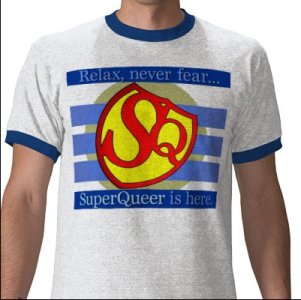
It is cute, but the Q is too small, making it look out of balance.
It is cute, but the Q is too small, making it look out of balance.
I would never promote anything Superman-esque.
However, i so want the site you designed that on!

it's called artistic impression - or sum such thing -- i kinda thought that too - at first - but then i kinda got it - -
instead of like S to the 2nd power - it's like S to the Q -- so it kinda ROCKS like that -
but - of course-- it's only for "the closet" ...
")

")
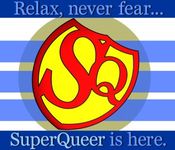
SuperQueer, I was able to rework your design a bit with some of my own ideas. I kept your main logo and gold background but made the text a more dynamic design element. I think your logo really pops on the blue background and yes, it now references Superman more directly which I think is kind of fun.
Oh, I accidentally truncated the text by leaving out "Relax."
")
Sorry dude...I find it kind of tacky looking..
Oh, for future reference, never use Times New Roman font on shirts, adds to the "Tackiness".
 I used a serif font 6 years ago when I first designed the SQ logo. It may have been Times New Roman. The name of the font I used in this shirt design is called "Bienetresocial" Compare the foot of the R the swoop on the Q and the square ended comma.