alfaPA
Sex God
... a more pervasive eyesore:

.
.
.
.
PLEASE READ: To register, turn off your VPN (iPhone users- disable iCloud); you can re-enable the VPN after registration. You must maintain an active email address on your account: disposable email addresses cannot be used to register.
Yes. It's the new addition attached to the old museum. In the second photo, you can see part of the brick wall and windowd from the old museum.
Imagine something like The Crystal stuck to the front entrance of Buckingham Palace or the White House.
It just wouldn't happen. But an iconic museum is fair game.
It's a travesty.


It is really aesthetic. Someones taste may not match your own.
I like the new addition.
It is really aesthetic. Someones taste may not match your own.
I like the new addition.
I like them all except the mcdonalds and the serra barricade. The rest of you are just objectively wrong.
It would have been okay if it hadn't been attached to the old building and become the new entrance. What's more, the inside is a nightmare for setting up displays. It's all angles and slanted walls.
The worst
The Michael Lee-Chin Crystal. Sure, there were a lot of Wal-Marts thrown up in the Aughts, but Daniel Libeskind's addition to the Royal Ontario Museum in Toronto surpasses the ugliness of bland functional buildings by being both ugly and useless. His aluminum-and-glass-clad crystalline forms grow out of the building's original 1914 structure, and from the street it's dramatic. But go inside and you need a map to move around its irrational and baffling dead spaces.
And where do you put art in a room of canted walls? Curators seem as baffled and frustrated by it as casual visitors. And it cost only $250 million.
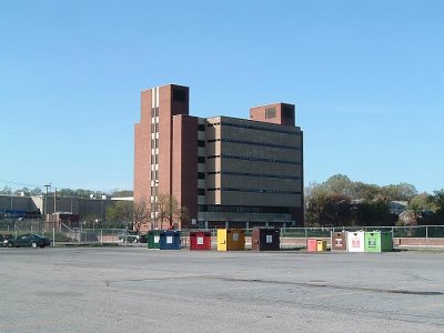
Serving our needs (and searing our retinas) since 1972...
They call this progress, I guess
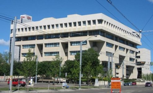
I'm going to go out on a limb and say it was designed by the same guy who designed the Denver Art Museum.

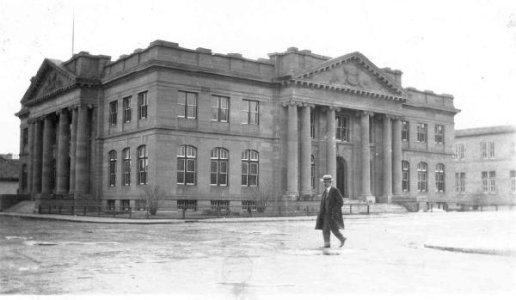
The ROM (Royal Ontario Museum) used to be a beautiful building until an addition was opened in 2007. It is easily one of the most painful pieces of architecture in Canada.
Much of the world agrees.
Post your own favourite painful architecture.
Here's the original ROM:

And here's the *shudder shudder* 'Crystal':
I was curious about how they fit the Crystal in front of the main entry that you have pictured here, because it looks like the street is relatively close.


Personally I like the contrast of the two buildings....especially since the original entry was preserved. The crystal is interesting and makes me want to go and see it...inside and out. It's a sculpture itself. The original facade is quite austere, drab and uninviting, imo. It is unfortunate that the snow/ice sheets off the roof onto streets and sidewalks. That's the poor planning part of this imo.
Is it just me or does it look upside down?