The Original Gay Porn Community - Free Gay Movies and Photos, Gay Porn Site Reviews and Adult Gay Forums

  • Welcome To Just Us Boys - The World's Largest Gay Message Board Community

    In order to comply with recent US Supreme Court rulings regarding adult content, we will be making changes in the future to require that you log into your account to view adult content on the site.
    If you do not have an account, please register.
    REGISTER HERE - 100% FREE / We Will Never Sell Your Info

    To register, turn off your VPN; you can re-enable the VPN after registration. You must maintain an active email address on your account: disposable email addresses cannot be used to register.

Remarks by the President on Common-Sense Gun Safety Reform

U.S. citizens who live outside just a couple of dozen counties are less likely than almost anyone to get shot at all, whether a criminal or someone they know.

A LOT more than a couple of dozen counties, actually. Hundreds, in fact.
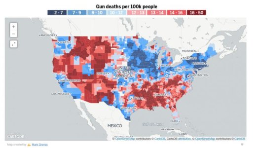
Screenshot 2016-01-25 16.22.26.jpg

http://projects.oregonlive.com/ucc-shooting/gun-deaths

BTW, I'm not that confident of your figures; I read recently that 70%+ of all killing are by criminals, so I suspect that a large protion of that 1,759 is criminals getting into arguments.

The data comes directly from the FBI's 2014 Report on Crime"

https://www.fbi.gov/about-us/cjis/u...le_11_murder_circumstances_by_weapon_2014.xls
 
There is no link unless you smear out the numbers to cover the whole nation.

Incorrect. The article and map I posted above disprove your statement. Average gun death rates in most developed nations are between 1 and 2 per 100, 000 people. At that level, almost every county in the US has above average gun deaths. But if we go by the US average of 10 per 100,000, there are still widespread bands of gun deaths across the south of the whole nation, encompassing many hundreds of counties.


The areas with the highest gun deaths correlate strongly with the areas of lowest gun ownership per capita, and the strongest laws making it hard to get guns. That says that the prevalence of guns is NOT a major factor in the prevalence of gun crime.

Unfortunately that is completely untrue, no matter how often gun advocates try to spread the lie.

"The totality of the evidence based on educated judgments about the best statistical models suggests that right-to-carry laws are associated with substantially higher rates" of aggravated assault, robbery, rape and murder, Donohue said in an interview with the Stanford Report. The evidence suggests that right-to-carry laws are associated with an 8 percent increase in the incidence of aggravated assault, according to Donohue. He says this number is likely a floor, and that some statistical methods show an increase of 33 percent in aggravated assaults involving a firearm after the passage of right-to-carry laws.

https://www.washingtonpost.com/news...-a-central-thesis-of-the-gun-rights-movement/


Why is it that there is more gun crime where there are fewer guns per capita?

There isn't. See above.

And why is it that the great majority of said crime is within the borders of just a couple of dozen counties?

It isn't. See further above.

States with fewer gun restrictions consistently and repeatedly have more gun crime, and quite often more crime in general.

http://www.slate.com/blogs/the_slat..._by_state_tougher_laws_mean_fewer_deaths.html

There's another correlation that I haven't seen hard and fast figures on, just reports: that there is more gun crime in areas where people tend not to have enough to eat. Another: there is more gun crime in areas where the schools are lousy.

I suspect that violent crime, guns or otherwise, is related to the fact that thanks to our creeping corporatism in the U.S., many people living in conditions of want and crowded together with little hope is a far, far more important factor than just about anything else.

Crime increases in areas of poverty around the world. This is not a unique US occurrence. But, of course, a hungry man with a semi-automatic weapon is a lot more dangerous in a crowd than a hungry man with a knife or a baseball bat.
 
Incorrect. The article and map I posted above disprove your statement. Average gun death rates in most developed nations are between 1 and 2 per 100, 000 people. At that level, almost every county in the US has above average gun deaths. But if we go by the US average of 10 per 100,000, there are still widespread bands of gun deaths across the south of the whole nation, encompassing many hundreds of counties.


Unfortunately that is completely untrue, no matter how often gun advocates try to spread the lie.


https://www.washingtonpost.com/news...-a-central-thesis-of-the-gun-rights-movement/


There isn't. See above.


It isn't. See further above.

States with fewer gun restrictions consistently and repeatedly have more gun crime, and quite often more crime in general.

http://www.slate.com/blogs/the_slat..._by_state_tougher_laws_mean_fewer_deaths.html


Crime increases in areas of poverty around the world. This is not a unique US occurrence. But, of course, a hungry man with a semi-automatic weapon is a lot more dangerous in a crowd than a hungry man with a knife or a baseball bat.

You're completely right, however you're trying to reason with someone who's trusting belief over logic and fact in this matter.
It's like trying to de-programme a cult member.
 
A LOT more than a couple of dozen counties, actually. Hundreds, in fact.

View attachment 1146116

http://projects.oregonlive.com/ucc-shooting/gun-deaths


The data comes directly from the FBI's 2014 Report on Crime"

https://www.fbi.gov/about-us/cjis/u...le_11_murder_circumstances_by_weapon_2014.xls

That's a fascinating map.

High gun death rate appear to correlate stongly with traditionally Republican parts of the country. And low gun death rates correlate strongly with traditionally Democratic parts of the country.
 
It seems very strange/improbable that the deserts and most unpopulated areas are dark red; Nevada, New Mexico. But populous, high crime areas like Los Angeles and New York are dark blue. It is either phoney or a misleading anomaly. In a desert area with virtually no people, a death in a century results in dark red. It is to much of a distortion to be meaningful.
 
It seems very strange/improbable that the deserts and most unpopulated areas are dark red; Nevada, New Mexico. But populous, high crime areas like Los Angeles and New York are dark blue. It is either phoney or a misleading anomaly. In a desert area with virtually no people, a death in a century results in dark red. It is to much of a distortion to be meaningful.

Or people in remote areas in certain places are more likely to shoot each other...

If there's a town of 200 people and two people have a gun fight over the recorded period, both fatal, then that town's rate is 1000 deaths per 100,000 residents.
 
Or people in remote areas in certain places are more likely to shoot each other...

If there's a town of 200 people and two people have a gun fight over the recorded period, both fatal, then that town's rate is 1000 deaths per 100,000 residents.

It isn't rocket science, is it......
 
Or people in remote areas in certain places are more likely to shoot each other...

If there's a town of 200 people and two people have a gun fight over the recorded period, both fatal, then that town's rate is 1000 deaths per 100,000 residents.

No doubt some such nonsense is the basis of the absurd chart.
 
No doubt some such nonsense is the basis of the absurd chart.

Although it's actually true...
If people in remote areas are dying at greater numbers per capita, then this serves to highlight that, as opposed to people waving at random cities in fear (when the real risk to life is in the apparent peace and calm elsewhere).
 
No doubt some such nonsense is the basis of the absurd chart.

Why am I not surprised that you are unable to extrapolate the data and understand such a simple map????
 
Why am I not surprised that you are unable to extrapolate the data and understand such a simple map????
You are only assuming that Kablueys example of the town of 200 is correct. To color the deserts dark red they should be full of such towns. To color the whole desert red because of a town with two deaths would be misleading would it not? It is impossible that there could be enough deaths in the desert areas to justify coloring the whole deserts dark red. Illinois with the murder capital of the US shows a tiny area of red surrounded by blue. At best the map is nonsense. At worst is another liberal manipulation designed to make the high crime democrat cities look good.
 
You are only assuming that Kablueys example of the town of 200 is correct. To color the deserts dark red they should be full of such towns. To color the whole desert red because of a town with two deaths would be misleading would it not? It is impossible that there could be enough deaths in the desert areas to justify coloring the whole deserts dark red. Illinois with the murder capital of the US shows a tiny area of red surrounded by blue. At best the map is nonsense. At worst is another liberal manipulation designed to make the high crime democrat cities look good.

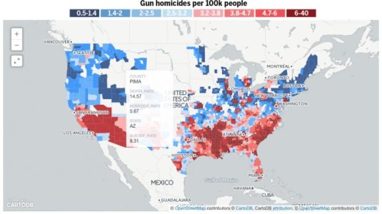
I think you are dramatically underestimating the sizes of the map segments. The map is divided into actual counties, and some of those counties are enormous. You can hover over each county on the map to get specific details of overall, homicide and suicide statistics.

To take a random example, I looked at Pima county in Arizona - a "desert" region, as you call it. Pima County is 9,200 square miles, with a population of 980,000. With an annual gun death tally of 14.57 in every 100,000, that suggests around 145 people are killed by guns in Pima County each year.

Screenshot 2016-01-26 10.54.23.jpg

I'm afraid I don't understand your confusion. The data is from the CDC, the county lines are real counties. How could it be clearer or simpler? It's data, pure and simple. There's no opinion expressed by data. Your criticism seems more about your own bias than the merits of the map.
 
The point is that any map which shows the entire virtually unpopulated areas of desert as high death-by-shooting areas, while showing LA and New York as low crime areas is misleading.
 
The point is that any map which shows the entire virtually unpopulated areas of desert as high death-by-shooting areas, while showing LA and New York as low crime areas is misleading.

These are rates of death, not total numbers.

It would seem to be that rural people (at least in the south and west) are more likely to get killed by guns. Which is not that surprising - they may have far more guns per capita than urban people.

It may also be that rural people in the midwest have fewer guns per capita than rural people in the south and west.

In other words, it may be that Republicans have a lot more guns per capita than Democrats - and they may be killing each other because of it.
 
...In other words, it may be that Republicans have a lot more guns per capita than Democrats - and they may be killing each other because of it.


They are shooting at the horde of course.
 
The point is that any map which shows the entire virtually unpopulated areas of desert as high death-by-shooting areas, while showing LA and New York as low crime areas is misleading.

It's not misleading. It's just not the data you apparently want to see. My point in posting it was to address Kulindahr's claim that most shootings in the US happen in a small number of counties. The map clearly shows that he is incorrect. Hundreds of US counties have higher than average gun death rates.

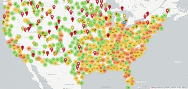
Here's a link to a different map that shows numerical counts of shootings in 2015, since that is apparently the data you would prefer to see. You can locate your own neighbourhood and see just how safe your immediate area is.

http://www.slate.com/articles/news_...died_or_been_injured_in_shootings_around.html

Screenshot 2016-01-26 11.56.27.jpg
 
Now compare your two maps. Your second map shows a large white area, most of Nevada with two deaths, but that area was dark red in the first. The second map shows large numbers in the area north of Chicagowhich was blue in the first.
 
Because they represent different data. One represents gun death PERCENTAGES within the localised population. The other represents numerical gun deaths. Of course the maps look different, they tell you different things!

It's like I gave you a slice of vanilla cake to demonstrate how nice my vanilla cake is, and you keep telling me it's terrible chocolate cake. It's not chocolate cake.
 
^^ You don't seem to understand the concept of death rate, ben.

The first map shows rates of death, the second total total numbers.

In 2015, the highest rate of gun death in the USA occurred in Renegade Mountain, Tennessee, when 4 people were killed. Renegade Mountain had only 40 residents, so that was 10% of the population. Chicago has 2,722,389 people. Chicago would have to have suffered 27,223 gun deaths in 2015 to equal the rate of Renegade Mountain, which had only four.

In 2015, Chicago had only 488 gun homicides. The gun death rate in Renegade Mountain, TN was more than 55x the gun death rate of Chicago. Despite the fact that Renegade Mountain had fewer than 1% as many total gun homicides as did Chicago.
 
Back
Top